The democratisation of data visualisation tools brought us two major advancements: we can make great analytical products, faster. We can deceive easier, too.
Previously a domain ruled by statisticians and IT departments, analytics have now opened up to anyone with a laptop. For marketers and managers alone, BI apps such as Tableau, QlikView, or MS Excel have become a commodity. Tools have matured too: programming fluency was overruled by drag-and-drop interfaces. A visually stunning chart is literally a click away. The software intelligently picks the graph type and the colour scheme for us. For the more ambitious users the adjustment options are plenty, although within the range of pre-programmed configurations. While some of these visual endeavours lead to great analytical products, some result in colourful nonsense.
Colourful nonsense can refer to covering up inaccuracies in data with design, or to design choices that render the data unusable. The former use is a give-away for crooks; the latter for data amateurs. Unless the motive is known, these two groups can be difficult to distinguish. A misleading graph can be created to conceal an uneasy fact, but it can also be a product of good intentions. This is not exactly news: deception, be it a product of deliberate planning or oblivion, is an inherent attribute of humanity.
What’s different today is that new analytical tools, especially ad hoc visualisation software, have elevated the colourful nonsense to look legit. The unprecedented analytical agility has given way to more data illiteracy than ever before: the most data-ignorant brute can pass for a data wizard. Instantly available visualisations shortened the time we would normally spend planning out the information design. Today, these decisions are made by vendor-brew machine-learning algorithms that produce dashboards looking too professional to question their accuracy. Just as with infographics ten years ago, we fell in love in the visualisation part of data visualisation, leaving out the most important: the value and the legibility of data.
For the technological progress to bring value, we need to make an educated use of it. As every-day consumers of data, we are responsible for our interpretation of it. Analytical mindset isn’t born, but intentionally learnt. Through questioning the data we use, the products we build, and the analysis we see, we change the conversation from passive to engaging. I’ve written about data-driven decision making in the past, and that’s just another facet of it: data on its own is no game changer, until we understand it.
As a practical test, I suggest reviewing the graph below in terms of its legibility. It’s a chart created by Gartner to illustrate the Worldwide IT Spending Forecast. Hint: it’s colourful nonsense of type 2: unintentionally bad. Stacked bar chart is the most emblematic example of poor data visualisation. It’s a chart that looks cool at the first sight and wants to say a lot, but fails at achieving either. Scarily, it comes as a default choice of visual representation by many top data-viz players in the market.
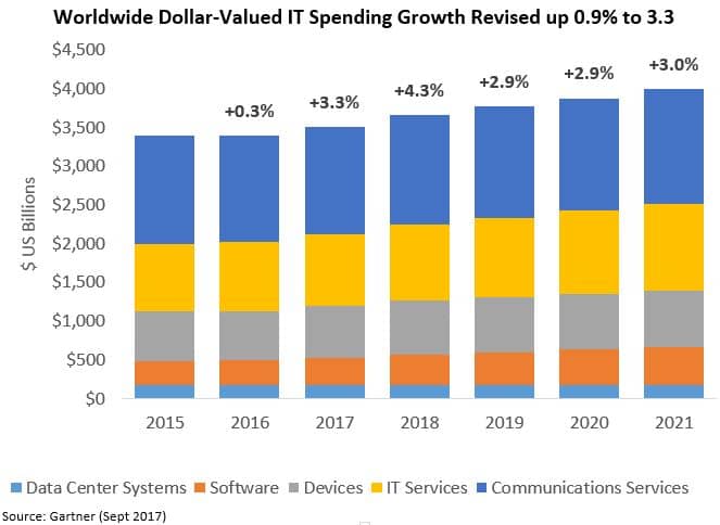
Besides the general trend, what else have we learnt about the spending for IT? Are we able to tell by how much “Devices” are supposed to grow in 2018? Will there be any growth at all or is the spending heading downwards? Better yet, what is the current spending for this category? Is it ca. $1,100 or $600? Do the categories sum up or do they overlap each other? What are their actual values, expressed in US dollars?
These sort of questions are very hard to answer even if you’ve got statistical background. Stacked bar chart is rarely a good choice: it sort-of works when the trend is the sole indicator we’re interested in, and when the categories (of which there are max. 2) are clearly distinguishable; ideally the numerical values are plotted too, so there is no confusion. Basically, these few cases when The Economist managed to pull it off. The above example clearly is not one of them. Neither is it an exception: just as Gartner, many otherwise excellent companies are guilty of deception: IDC and NPR to name a few that came up in my Google search. An honest mistake will often go unnoticed, but every now and again it will lead to dramatic repercussions. In the past, I’ve written about cases where a poorly designed visualisation made the media panic.
If there was one take away of this article, it’d be that: don’t let sleek visualisations fool you. Instead, make sure you understand the data behind it. When in doubt, question whoever is using it. There is a chance they don’t get it either.
Follow @EveTheAnalyst